Veganly

Helping users cook plant-based meals based on ingredients they have at home.
Veganly is a mobile application designed to empower vegans and plant-based eaters by simplifying meal planning through ingredient-based recipe suggestions. The platform enables users to reduce food waste, explore new recipes, and embrace a healthier lifestyle.
Challenges
-
Users struggle to find recipes that match the ingredients they already have.
-
Generic recipe platforms lack personalization based on dietary preferences and skill levels.
-
Beginner vegan cooks face time constraints, limited knowledge, and meal planning fatigue.
Skip to
My Role
UX/ UI Designer, User Research, Prototyping
Tools
Figma, Photoshop, Illustrator
Team
Me + 1 Developer
Duration
Jan 2024- Jun 2024
Product Development

Process
Competitor Study
-
Limited ingredient-based recipe matching
-
Weak vegan or dietary filters
-
Recipe difficulty and time often missing
-
No focus on food waste reduction
-
Generic personalization, not skill/need-based
-
Overwhelming search results with poor filtering

User Research
6 User Interviews · 15 Survey Responses
Key Insights
👩💻
👨💼
👩💼
"I always end up Googling recipes and then realize I’m missing half the ingredients."
"Sometimes I just need a recipe that tells me, this is easy, this will take 20 mins max."
"I wish there was something that just gave me ideas based on what's already in my fridge."
Pain Points
-
Hard to find recipes with available ingredients
-
Lack of quick, easy vegan recipe options
-
Overwhelming search results without personalization
User Persona

Natasha, 20
International Student
-
Find vegan recipes using ingredients she already has
-
Manage cooking time efficiently alongside studies
-
Gain confidence and improve her vegan cooking skills
-
Struggles to find recipes that match available ingredients
-
Recipes are often time-consuming and complex
-
Limited beginner-friendly vegan recipes that suit her taste
-
Ingredient-based recipe suggestions
-
Preview recipe time, difficulty, and calories upfront
-
Step-by-step, easy-to-follow vegan recipes for beginners
Goals
Pain Points
Opportunities
Based on Natasha’s persona, I identified key tasks by mapping her goals and pain points to essential app interactions. This helped prioritize features like ingredient-based recipe discovery and easy-to-follow cooking steps, directly addressing her needs for efficiency, skill-building, and minimizing food waste. Further, two key features were identified.
Feature Prioritization

Feature 1
Ingredients Management System
Feature 2
Browse Recipes

Storyboard and Paper Prototype Testing
Identified Task
-
Storyboard
-
Paper Prototype
User Testing
Task 1 | Finding a recipe
Features:
-
Making a recipe out of existing ingredients
-
Finding a vegan recipe on Veganly application
-
Deciding on a recipe from the options
Storyboard:
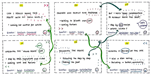
Natasha goes grocery shopping on a Sunday morning and decides what to cook afterwards. When she comes back home, she tries to find vegan recipes, but can't come across any personalized recipe option that caters to the ingredients she bought. Thus she uses the Veganly application to decide on a recipe relevant to her.

Storyboard Planning


Paper Prototyping


User Journey
● Welcome page
● Home page
● Add ingredients
● Scan ingredients
● See recipes based on cart
● Get recipe options
● Choose a recipe
Task 2 | Following a recipe
Features:
-
Gauging the difficulty level of the recipe
-
View the preview of the recipe, ingredients list, difficulty level and reviews before commencing the recipe
-
Following the recipe and leaving a review
Storyboard:
Natasha wants to know the difficulty level and steps of the recipe and calls up her friends and family. She needs a step by step process that she can follow. She also wants to know the level of cooking the recipe requires as she is new to cooking and read reviews.

Storyboard Planning


Paper Prototyping
User Journey
● List if ingredients
● Steps Preview
● Link to video
● Reviews and star rating from users
● Starting the recipe
● Getting a detailed step by step
● Add feedback as rating and comments at the end of the recipe
● Return to home page
User Testing
For paper prototype testing, I recruited two participants who represented our target user demographic - individuals interested in vegan cooking, specifically those looking for recipes based on the ingredients they have in their kitchen. Both participants are international students who have little to no experience in cooking.

Participant 1: Karan (Age: 24)
Karan is a tech-savvy vegan enthusiast and a startup founder and student. He has been vegan all his life and is always eager to try new recipes. I recruited Karan through a social media vegan community group as he was an active member.


Participant 2: Aryan (Age: 24)
Aryan is a university student with limited experience in cooking. He recently decided to transition to a vegan diet. We recruited Aryan through a whatsapp group at Cornell University, where he expressed interest in vegan cooking and showed willingness to test paper prototypes.


User Feedback
✅ Validation
-
Users found the app visually appealing, appreciating the colors, images, and icons.
-
Search functionality was useful, with a desire for predictive text to enhance the experience.
-
Participants liked the error messaging concept but suggested adding clearer timelines and context.
⚠️ Scope for Improvement
-
Terminology confusion between "Recipe" and "Your Ingredients" sections created uncertainty.
-
Users struggled with navigation flow - unclear backtracking, screen transitions, and missing guidance.
-
Ingredient input process felt unintuitive; users needed better clarity on how to add/edit items.
-
Desire for additional filters like gluten-free or low-calorie options for recipe suggestions.
🛠 UI Refinement
-
Button labels and icons need better clarity to prevent misinterpretation.
-
Add tooltips or brief explanations to guide first-time users and reduce confusion.
User Flow
-
Users build their ingredient list by scanning grocery bills or manually adding items through search, categories, or usual additions.
-
The updated list allows users to review, edit, or refine ingredients before proceeding.
-
Users browse recipe suggestions tailored to their ingredients, with options previewing time, difficulty, and calories.

Product
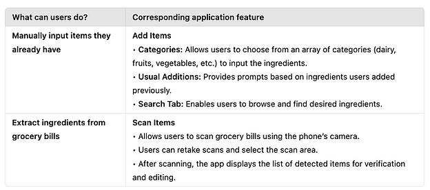
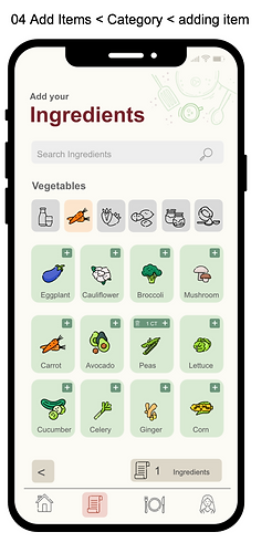
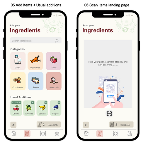
Feature 1: Add Items
-
Select ingredients by category.
-
Add frequent items via suggestions.
-
Search and add ingredients manually.
-
Edit or remove items anytime.


Feature 2: Scan Items
-
Scan grocery bills using the camera.
-
Adjust scan area for accuracy.
-
Review and confirm scanned items.
-
Edit incorrect entries if needed.
Feature 3: Browse Recipes
-
Get recipes based on available ingredients.
-
View matched vegan recipes.
-
Preview difficulty, time, and calories.
-
Select recipes easily with key info.

Mobile Prototypes


UI Components

User Testing
✅ Validation
-
Users found the overall flow intuitive and appreciated the clean visual hierarchy.
-
Recipe previews showing difficulty, time, and calories helped them choose recipes confidently.
-
Ingredient categories and the “Usual Additions” feature were seen as time-saving and easy to use.
⚠️ Scope for Improvement
-
Icons caused confusion, users mistook the trash icon for back or exit.
-
Navigation needed better indicators; users were unsure where they were in the flow.
-
Ingredient scan lacked clear feedback or confirmation after scanning.
-
Participants suggested adding a save/favorite option for recipes they liked.
Reflections
-
Running both paper and digital prototype testing taught me the value of iterative feedback. Early paper testing uncovered broad usability issues, while digital testing surfaced finer UI details, reinforcing that each testing phase plays a distinct role in shaping the product.
-
I learned that balancing simplicity with guidance is crucial, minimal design can’t compromise clarity, especially for first-time users navigating unfamiliar features.
-
Small design decisions, icon choices, flow logic, preview details, carry a larger impact on user trust and ease of use than expected. Attention to these micro-interactions improved the overall experience.